Friday, February 25, 2011

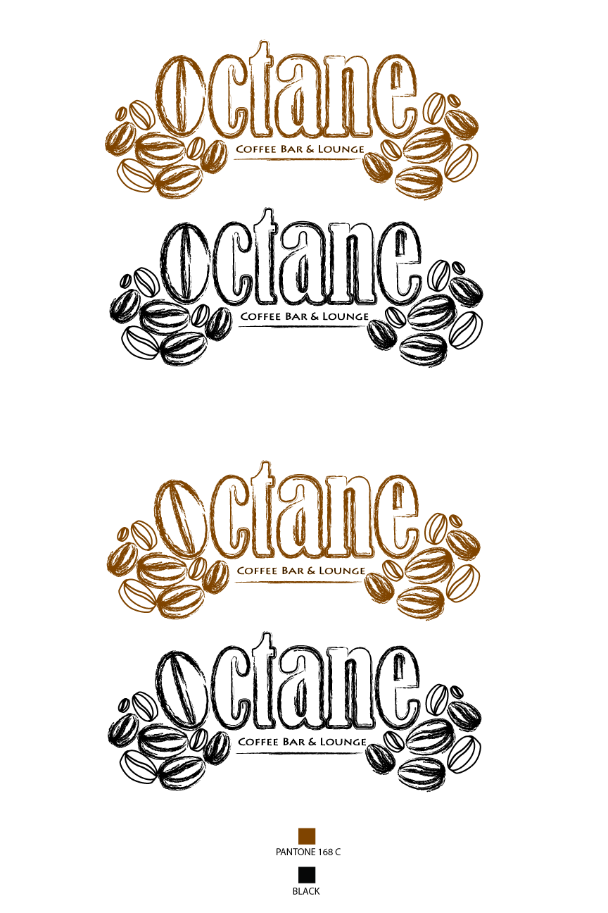
Revisions to Octane Logo >>> Email me Opinions!! :-D


I made to alternate octane logos. I have surrounded the words octane with coffee beans...I really like the way it looks. In one logo, the "o" in octane is slightly tilted, just wanted to see what that would look like? However, I really like the top logo. :) Hope you do too?? I just need opinions at this point. Everyone is on Spring Break now, but if you happen to take a peek at my blog, I'd love to hear what you think. Just email me, sydramarie@gmail.com. Thanks!!

Wednesday, February 23, 2011

Final Octane Logo (for now) :)

Here is the final product, unless I have some grand epiphany of a way to improve it, this will be the final "Octane" logo! :)

Tuesday, February 8, 2011

Octane Logo Design Ideas (In-Progress)


 After the in-progress critique on 2/7, I have come up with more designs, using a coffee bean to represent the "O" in octane and played around with both the Chiller and Bernard MT Condensed fonts to see how I like the combinations. So far, I do like the coffee bean serving as the "O" but I feel like it needs more. HELP??!

Below are some more ideas, but I haven't gone any further with them. Don't know if I should??

Some of my old design projects from GRD 3000

 Poster Design - The Color Purple
Package Design (Cylinder) - Kotex Tampons

Monday, January 24, 2011

Logo Re-design

Delta Logo Re-design

Least Favorite Logos


Enron Logo


Zipliner Logo

Catholic Church Childen's Ministry


Institute of Oriental Studies


Clinica Dental Logo

Favorite Logo Designs


 Art Farm Logo
CFO Cycling Team


Code Fish Logo


Coffee Logo


Eat Innovations Logo


Eight Logo


Einstein Brothers Bagels Logo


Love Clip Logo


Sushi Restaurant Logo